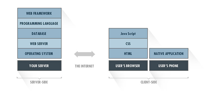
1. Front-end tech stack
The front-end is the visual part of your application that users will see and interact with. This interaction can happen through a web browser or a mobile app. When building for the web, the front-end tech stack is made up of:
- HTML (Markup Language)
- CSS (Style Sheet Language)
- JavaScript (Scripting Language)
Front-end frameworks are optional, though recommended:
- JavaScript frameworks include tools for building rich, interactive web experiences. Recommended: AngularJS, Backbone.js, ReactJS
- Presentation frameworks provide a standardized format for creating responsive web pages with clean aesthetics. Recommended: Bootstrap
For a mobile app the tech stack is simply comprised of an iOS or Android app written in Objective-C/SWIFT or Java, respectively.
Mobile or Web? Design for your target user base
More than 60% of web traffic now comes from mobile devices, and 25% of Americans use only mobile devices to access the internet. These trends will continue to accelerate, so incorporating mobile into your strategy is only a question of when, not if.
However, you shouldn’t rely just on general statistics. Refer to the key constituents you identified when designing your MVP and the value proposition your product will offer them. Are users more likely to engage with your product on their phone while on the go, or while sitting at a desk in their office? You should generally launch your MVP on only one platform – mobile or web. Spending the additional resources to build and maintain two separate interfaces is better justified after you have made progress in validating your product.
With the big picture in mind, the usage patterns of your particular audience will guide you towards a mobile first, mobile only, or mobile later design approach.
Mobile first
The term “mobile first design” means building a responsive web app that adjusts well to all screen sizes, but making sure the UI looks great on a small mobile screen first.
Responsive web apps are easy to discover through a google search or a shared link and instantly available without downloading anything. They are cheaper to develop than native apps and easier to iterate on, serving as a useful tool for quickly validating your product. Launch with a responsive web app if your product:
- Serves content to a broad audience of desktop and mobile users
- Contains rich material that can be leveraged for SEO
- Has a simple UI that can be navigated without frustration on a mobile browser
Examples: Etsy, Vimeo, Scribd
Mobile only
In a mobile only approach your MVP will be offered exclusively as a native mobile app downloaded from the app store. Mobile users expect interfaces that look great and work smoothly, and native apps offer the best experience.
It is generally advised to develop an iOS app for an MVP and only later add an Android version.
Even though Android holds a larger market share with 52% in the US and 80% worldwide, the need to support hundreds of different devices makes it more cumbersome to develop for. There are more than enough iOS users to validate your product and they tend to be more engaged, spending four times as much as Android users. Launching with both will significantly increase your time to market, and you’ll be doing twice the work on every product iteration. Launch with a native app if your product:
- Will be used primarily on mobile
- Needs access to device features like the camera, GPS, or accelerometer
- Will benefit from real-time interactions like push notifications and micro purchases
Examples: Instagram, WhatsApp, Uber, Waze
Mobile later
In some cases, an MVP should be a traditional web app with no consideration given to mobile design. For example, many SaaS products are targeted at business users who mainly interact with the product through a desktop or laptop browser. A companion mobile app that provides complementary functionality can be developed later. Launch with a traditional web app if your product:
- Will be used primarily on a desktop or laptop
- Requires a complex user interface
- Accepts file uploads like spreadsheets or large images
Examples: MailChimp, ZenDesk, Xero